


 12 / 33

The
grain and oilseed industry
of south africa – A journey through time
12
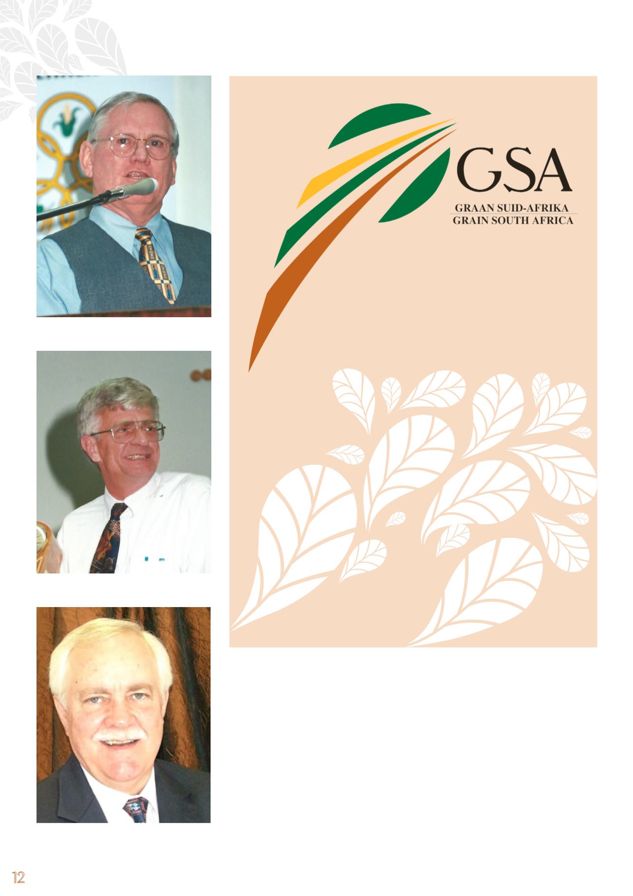
Grain SA logo – creative explanation
The colours green, brown and yellow were used to depict the soil (brown),
growth (green) and the sun (yellow). The logo is in the shape of a sheaf of
wheat, but it also depicts fields with the sun shining on them – contributing
to growth and survival. The two ‘husk leaves’ at the top represent the origin
(seed) of the plant, which breaks open and produces a new plant (growth). The
sun rising across the fields creates the illusion of hope, growth and progress.
The second level of symbolism depicts values on which Grain SA has been
built. The different colours of the ‘fields’ confirm that these organisations
are there to support the grain producer on different levels. The sun and free
movement of the logo design indicate that Grain SA is focused on the sus-
tainable survival of the grain producer and agriculture in South Africa.
Van Zyl was appointed as the first General Manager of the GPO. By April 2000 his
management team included the following persons:
• Dr Kit le Clus (Research and Development)
• Mr Fanie Brink (Commodity Services)
• Mr Johan Loxton (Commercial Services)
• Mr Nico Vermaak (Manager Administration)
• Ms Rita de Swardt (Accountant)
By the time he retired on pension in 2001 the new grain industry organisation,
Grain SA, was established as an organisation, with sound administrative and finan-
cial controls in position and ready to face the challenges of promoting producer
interests in an uncertain future.
Mr Fanie Brink
Mr Giel van Zyl
Dr Kit le Clus